
A dashboard shows incident counts falling, and the leadership team is pleased. But before calling that progress, the WHS manager needs to ask whether fewer people are being hurt, fewer events are being reported, or the workforce's exposure has changed.
Incident management metrics only support sound decisions when the team understands what each figure captures and what it misses. That means looking beyond injury and claim totals to reporting health, exposure, severity and whether corrective controls are working.
Table of Contents
- The Reporting Gap Behind Your Incident Numbers
- Lagging and Leading Indicators Explained
- The Core Incident Metrics WHS Teams Actually Use
- How to Tell Real Improvement From Silent Under-Reporting
- Building a Dashboard That Links Outcomes to Controls
- Why Psychosocial Metrics Belong on the Same Dashboard
- Running a Monthly Metrics Review That Drives Action
The Reporting Gap Behind Your Incident Numbers
A WHS manager presents a chart showing incident counts falling year on year. Leadership sees improvement. A site supervisor, however, knows that workers have been handling minor injuries informally, contractors aren't using the reporting process consistently, and near misses rarely make it into the system. The chart may be accurate about recorded events, but it doesn't necessarily describe what's happening at work.
Australian data illustrates the gap. In 2021–22, 3.5% of people who had worked during the previous 12 months reported a work-related injury or illness, but only about one third of affected workers made a workers' compensation claim (Australian Bureau of Statistics work-related injuries data). A claim-based rate therefore isn't a complete count of harm. It's a count of events that reached a particular reporting and claims process.
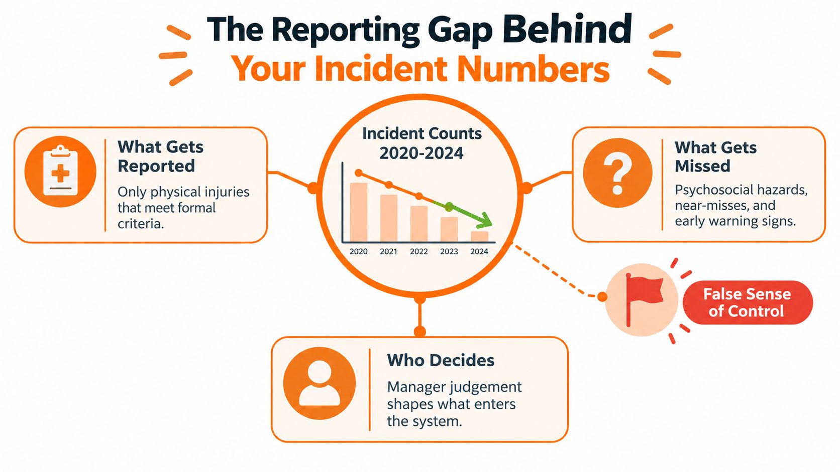
Workers may stay quiet because they fear blame or consequences. Some get informal treatment and return to work without a formal record. Contractors may sit outside the usual process, while language barriers can make reporting difficult. A manager's judgement can also shape what gets entered, especially when the process seems intended only for injuries serious enough to require time off.
Practical rule: A low incident count is a result to investigate, not proof that risk has fallen.
Metrics become useful when teams are clear about what the data includes, who can report, and what may be missing. A credible dashboard pairs lagging indicators, which record outcomes, with leading indicators, which test reporting processes and controls. Neither family proves progress alone. Together, they give a WHS manager a better basis for deciding whether performance has improved or the organisation has grown quieter.
Lagging and Leading Indicators Explained
Lagging indicators count outcomes that have already happened. They include injuries, lost-time cases, claim frequency, days lost and incident severity. These figures show the consequences of risk, but they can't tell a manager on their own whether hazards are being controlled or whether unreported events are distorting the picture.
Leading indicators track activities and controls that can influence future outcomes. They include hazard and near-miss reports, inspection completion, corrective-action progress, worker participation and supervisor follow-up. A completed inspection isn't automatically evidence of safer work. The useful question is whether it found a relevant hazard and led to an effective control.
Think of lagging measures as the rear-view mirror and leading measures as the windscreen. A rear-view mirror shows what has happened. The windscreen helps the driver anticipate what's ahead. Safety Work Australia's national fatality data underscores why control measures matter: vehicle incidents and being hit by moving objects together accounted for 54% of Australian worker fatalities in 2023 (Safe Work Australia fatality data). Injury counts alone won't show whether traffic separation, plant checks or reversing controls are in place and effective.
Leading measures are harder to standardise because a completed inspection, a useful hazard report and an overdue high-risk action aren't interchangeable. That's a strength when teams define each measure carefully: the figures can reflect the actual work and controls, rather than a convenient but shallow count. For a concise overview of how to pair leading and lagging signals, focus on measures that illuminate the same risk from different angles. A practical guide to leading and lagging indicators can also help teams choose a balanced set.
Notifiable incidents sit in a separate category. A PCBU must notify the relevant WHS regulator immediately after becoming aware of a death, serious injury or illness, or dangerous incident arising from work carried out by the business. The incident site generally must be preserved until an inspector arrives or directs otherwise, subject to limited exceptions. Each family of measures answers a different question, and the core metrics below show how to use them.
The Core Incident Metrics WHS Teams Actually Use
A useful KPI has a defined numerator, denominator, time period and decision attached to it. Where workforce hours vary, rates should be exposure-adjusted rather than compared as raw counts. Hours worked help explain whether a change reflects a different amount of work, while site and severity splits show where risk is concentrated.
| Metric | What it measures | Common trap |
|---|---|---|
| Total recordable incident frequency rate | Recordable incidents relative to hours worked, commonly per million hours | A low rate can hide severe cases or missing reports |
| Lost-time injury frequency rate | Lost-time injuries relative to hours worked | Can discourage reporting of injuries that don't cause time off |
| Severity rate | Days lost per incident or per million hours, using a consistent definition | Averages can hide a small number of long-duration cases |
| Workers' compensation claim frequency | Claims relative to exposure hours | Claims capture only events that enter the compensation system |
| Near-miss reporting rate | Near-miss reports relative to a defined workforce or exposure measure | More reports can reflect stronger reporting, not worsening risk |
| Corrective-action closure | Time to close actions and the share completed by due date | Closing an action doesn't show that risk was reduced |
| Higher-order control share | Actions using elimination, substitution or engineering controls | A percentage means little without quality checks on the controls |
A total recordable incident frequency rate (TRIFR) gives a broad view of recordable injuries relative to work hours, but it doesn't show whether injuries were minor or severe. A lost-time injury frequency rate (LTIFR) focuses on cases involving time away from work. Used alone, it can create pressure to classify or manage minor cases in ways that keep the rate down.
Severity rate adds consequence to frequency. Teams need to state whether they're measuring days lost per case or days lost per hours worked, then use that definition consistently. Claim frequency adds another view, but it reflects claims rather than all harm. Near-miss reporting is only interpretable when the team defines both the reporting count and the denominator, such as workforce size or exposure hours, and checks whether reporting participation is changing.
Australian benchmarks can provide context, not targets. In 2022–23, agriculture, forestry and fishing recorded 11.3 serious claims per million hours worked, against an all-industry average of 6.6; construction was reported at 9.8 serious claims per million hours in 2021–22 (Safe Work Australia's 2024 WHS statistics). These figures can help a business frame comparisons, but differences in work, workforce and reporting mean they shouldn't be treated as a direct scorecard for an individual site. A recordable incident rate calculator can help check the arithmetic, but the calculation still depends on accurate classifications and hours.
How to Tell Real Improvement From Silent Under-Reporting
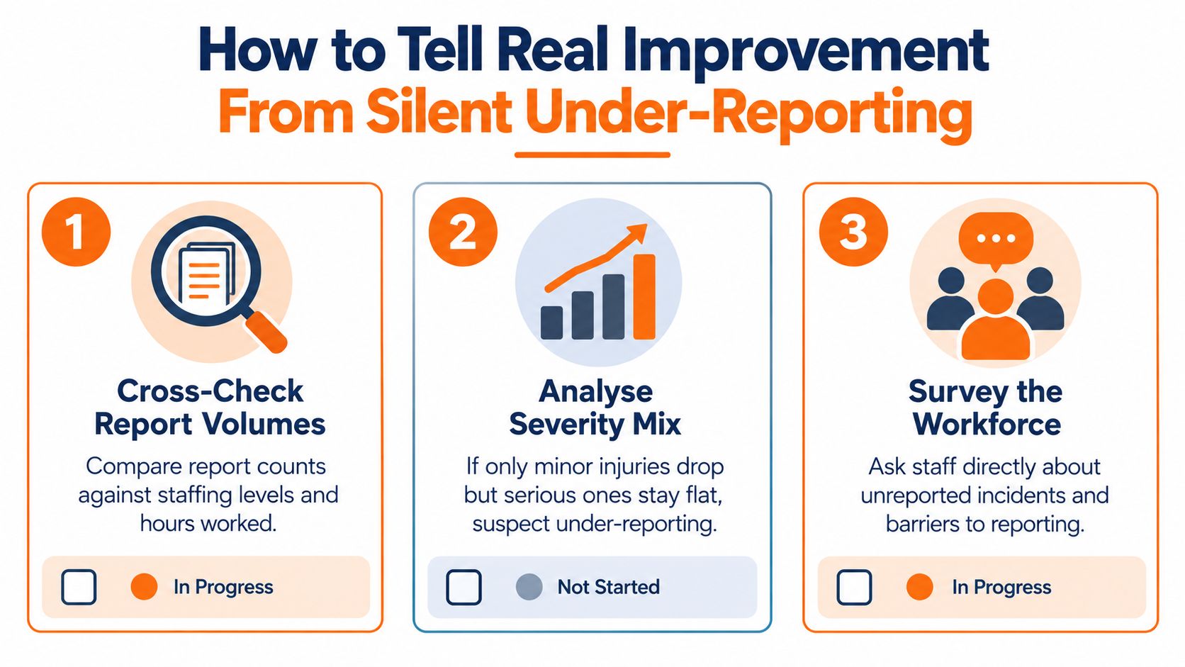
When incident counts fall, three explanations deserve a check: fewer events occurred, fewer events were reported, or the exposure denominator changed. A falling rate can also be affected by changes in hours worked, so counts and rates should be reviewed together rather than treated as competing versions of the truth.
Start by comparing reporting-process indicators over time. Look at near-miss submissions relative to the workforce, time between an event and its report, and whether workers receive feedback after making a report. Track anonymous reporting use too. A decline in injury reports alongside falling near-miss reports and slower reporting deserves closer attention than a decline accompanied by steady hazard reporting and prompt follow-up.
Check the mix, not just the total
Compare first-aid-only cases with total incidents, and examine changes in injury severity. If minor reports fall while more serious cases remain unchanged, the change may reflect lost reporting rather than safer work. Review site, shift, contractor and employee data, and consider whether workers in different language groups can access the same reporting process. Aggregated numbers can hide gaps that are concentrated in particular roles or parts of the workforce.
Safe Work Australia recorded a fatality rate of 6.7 deaths per 100,000 workers for machinery operators and drivers in 2023, more than five times the overall worker fatality rate (Safe Work Australia's 2024 national statistics release). That difference shows why one organisation-wide figure can obscure very different risk profiles. A site with substantial driving or machinery exposure needs to read its results alongside role-specific hazards and controls.
Treat more minor reports as useful information
A rise in near misses or minor reports can mean workers have more confidence that management will listen. The signal becomes more credible when reports receive feedback and lead to timely corrective action. Suppressing minor reports to improve a headline rate does the opposite: it removes information that might help the business prevent a more serious event.
The right comparison isn't “more reports versus fewer reports”. It's whether reporting participation, workforce exposure, severity mix and control performance move in a pattern that supports the same conclusion. If they don't, the dashboard should flag uncertainty rather than label the trend an improvement.
Building a Dashboard That Links Outcomes to Controls
A useful dashboard separates three questions: what harm occurred, whether critical controls were in place, and whether workers are reporting concerns. Each group should lead to a management decision. Outcomes indicate where escalation may be needed; control measures help identify what failed; reporting-health measures help assess whether the recorded picture can be trusted.
Organise measures around decisions
Keep the lagging block focused on injuries, severity, claims and days lost. Segment these by site, project, incident type and employment group where the data is reliable. The leading-control block can show inspection completion, investigation timeliness, actions closed by their due dates, overdue actions weighted by risk, and whether actions rely on higher-order controls.
Corrective actions need more than a closed status. Track investigations completed by their due dates, time from event to competent investigation, action closure by due date and the share of completed actions using elimination, substitution or engineering controls. Require evidence of implementation and effectiveness, such as a revised guarding arrangement or worker verification, before an action counts as complete. For a wider perspective on how teams compare HR dashboard approaches, look for ideas about presenting measures clearly while keeping decisions tied to the data.
The reporting-health block can include near-miss submissions, time to report, worker feedback after reports and first-aid-only patterns. These measures help a manager distinguish a genuine change in risk from a change in reporting behaviour. They're not a score for supervisors to chase; they're checks on whether workers can raise concerns and see action.
Give notifiable incidents their own view
Record the time an event occurred, when the business became aware, when it was reported internally and when the regulator was notified. Include preservation status, the regulator reference and investigation progress. The dashboard should make late or missing notification steps visible, not bury them inside an “incident closed” status.
Australian WHS notification requirements apply to PCBUs, with the relevant regulator and administrative workflow varying by state or territory. In New Zealand, the equivalent framework is the Health and Safety at Work Act 2015, administered by WorkSafe NZ, with related expectations to notify notifiable events and preserve the scene. Businesses operating across jurisdictions should map each workflow to the applicable regulator.
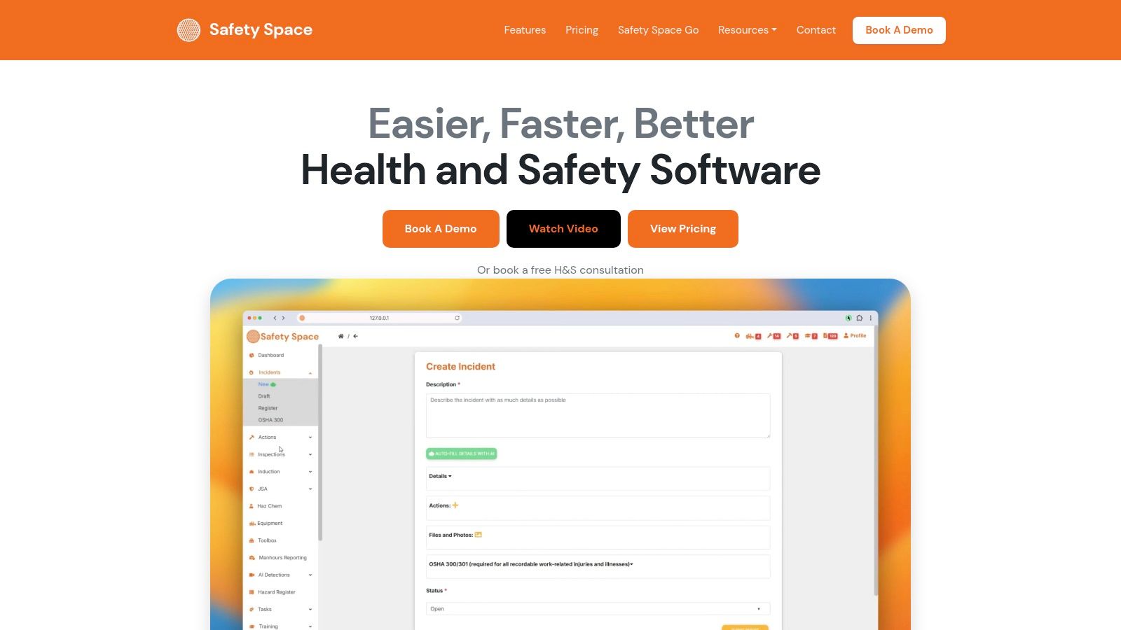
When a team is ready to build the dashboard in software, Safety Space includes incident and injury reporting, corrective actions, dashboards and a map view by site. Those functions can support site-level review, but the team still needs consistent definitions, reliable hours and clear ownership of each metric.
Why Psychosocial Metrics Belong on the Same Dashboard
A dashboard built only around physical injuries can miss psychosocial harm until a worker is absent, disengaged or makes a claim. Claims and completed investigations are useful outcome measures, but they arrive too late to show whether workload, fatigue or other psychosocial controls are working day to day.
The national claims picture makes the issue difficult to ignore. In 2023–24, mental health conditions made up 12% of serious workers' compensation claims, an increase of 14.7% on the previous year and 161% compared with a decade earlier. 84% of serious claims nationally were concentrated in body stressing, falls, being hit by moving objects or mental stress (Safe Work Australia's 2025 key statistics). Those categories span different hazards, so an overall injury count can't tell a manager whether psychosocial controls need attention.
Useful leading measures should connect to actions managers can take. Track how quickly reports receive a response, whether the same psychosocial hazard recurs, how long related actions remain open, whether supervisors complete follow-up, and whether workers believe concerns will be acted on. Workload and fatigue alerts can also show where work demands or schedules need review. These measures should remain connected to hazard controls and worker participation, not collapsed into a single “psychological injury rate”.
Queensland's mining regulator separately requires reporting of high-potential incidents and psychosocial hazard incidents, including bullying and sexual harassment. That reinforces a practical point for other sectors too: incident systems need ways to capture hazards before they become injuries or claims. A psychosocial risk assessment can help teams connect reported concerns with the risks and controls they need to review.
Running a Monthly Metrics Review That Drives Action
A monthly review should test the data before judging performance. Start with reporting health: check report timing, worker feedback and participation patterns. If those indicators have shifted, treat changes in injury counts cautiously until the team understands why.
Then review lagging outcomes by site and severity. Pick the worst outcome patterns and examine the leading controls linked to them. If vehicle events recur, for example, check the relevant traffic-management actions and inspections rather than presenting the event count without a control review.
Close the meeting by assigning actions, owners and dates. Escalate when a high-risk action is overdue, the same causal factor recurs, an action closes without verified risk reduction, or a notifiable event misses the required notification timing. Small teams that need a simple starting point can consider Safety Space Go, a self-service forms product available on the web and mobile apps.
Use this short check at the next review:
- Trust the data: Have reporting behaviour and exposure hours changed?
- Find the pattern: Which site, role or severity group needs attention?
- Test the controls: Are actions effective, verified and closed on time?
- Assign ownership: Does each agreed action have an owner and due date?
Safety Space provides workplace health and safety software with incident reporting, corrective actions and dashboards for reviewing trends across sites. Visit Safety Space to see how its tools could support your incident metrics and follow-up process.
Ready to Transform Your Safety Management?
Discover how Safety Space can help you implement the strategies discussed in this article.
Explore Safety Space FeaturesRelated Topics
Safety Space Features
Explore all the AI-powered features that make Safety Space the complete workplace safety solution.
Articles & Resources
Explore our complete collection of workplace safety articles, tools, and resources.